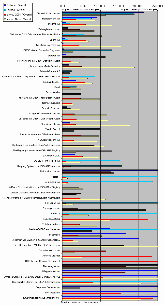
Graphical Comparison
of Registrar Choice by Category
Alternative Perspectives on Registrar Market
Share
For each registrar, the chart below gives the ratio of that registrar's market share in a given category to that registrar's market share overall. For example, if a registrar had a 5% share of Fortune 1000 registrations but a 10% share of all registrations, the Fortune 1000 value for that registrar would be 50% because 0.05/0.10=0.50=50%.
A value greater than 100% indicates that a registrar is "overrepresented" in a given category, relative to its overall market share; such values are depicted with bars that extend towards the right of the graph. (Extreme values are truncated at 250%.) Conversely, a value less than 100% indicates that a registrar has disproportionately few registrations in that category, relative to its overall market share; such values are shown with narrow bars remaining towards the left side of the graph.