Networks on which Site Finder
is Disabled - Chart
The Deployment of VeriSign "Site Finder"
and ISP Response
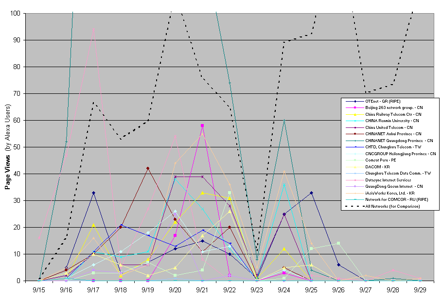
The chart below reports the number of page views from specified IP network blocks to VeriSign Site Finder. The data is taken from the table of Site Finder Usage Over Time.
Notice that each network plotted on the chart shows a distinctive pattern of growth in Site Finder traffic (beginning September 16-17) and ultimately a decline of traffic (later in the month). These patterns depict the observed result that, on these networks, Site Finder was for a time enabled (causing the spike in traffic) but was subsequently blocked (causing the subsequent drop).
The black dotted line plots overall Site Finder usage across all users (not just users on networks that blocked Site Finder), shown for comparison purposes. This comparison plot uses a Y axis (page views) normalized by a factor of 150 to make results comparable.
The reason for the September 23 drop in traffic, seen across all networks graphed here as well as among others in our data set, is unknown. This could reflect an extended denial of service attack on the Site Finder service, problems with Alexa's data collection systems, or other errata.